|
|
NEW IN MILESTONES PROFESSIONAL 2023New features added were requested by our customers:
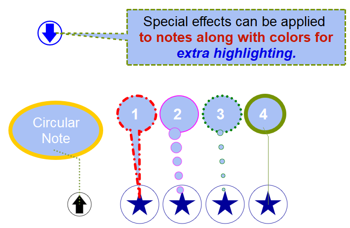
SYMBOL NOTE ENHANCEMENTSDisplay notes in a circle/ellipseSymbol notes are used, in addition to symbol text, to annotate dates on the schedule. They are easy to move and can be used for lengthy or short notes. A new feature, useful for presentation schedules is the option to display notes in a rounded shape. Here’s an example:
All lines types are available to be used for symbol notes borders.
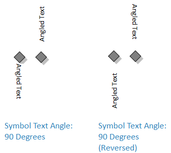
Show angled symbol text at a reverse angle:
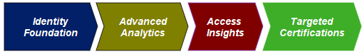
BAR AND SYMBOL CUSTOMIZATION2 new connector Bar TypesHorizontal bar types 74 and 75 offer a taller connector with built-in arrowheads:
Individual override of bar outline color
Customization of pattern bar types
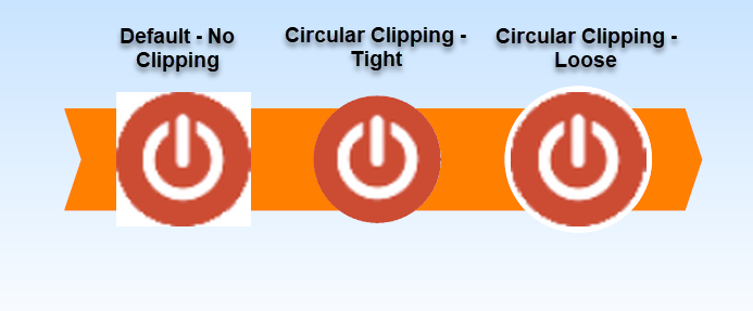
Circular bitmap symbol clipping improvedFor quick, easy and consistent clipping of circular bit map symbols.
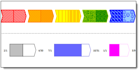
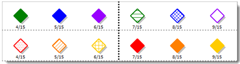
New Symbol patternsChoose from one of the 50+ fill patterns for symbols. For each toolbar symbol, customize both the before status (complete) and after status (not complete) fill.
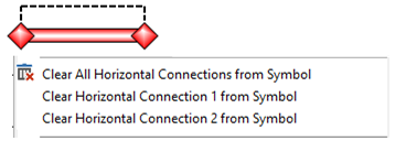
New symbol right-click optionEasily clear connections from a symbol
COLUMN AND DATE HEADING CUSTOMIZATIONMinimize the date headingWhen space is at a premium, minimize the Date Heading space. Normally, a cushion of about one half of the text height is reserved above and below the heading text. With Minimize Height selected only about one tenth of the text height is reserved. Default with padding:
Minimized
Add Prefixes And Suffixes To FY Headings Fiscal year date headings can now have prefixes and suffixes.
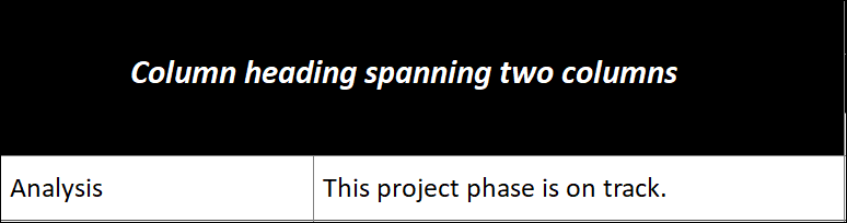
Hide Inner Gridline for a Column HeadingAn option was added to the Column Heading that lets you hide the inner side of a column heading to make it appear two or more headings are a single heading. Text Overflow is an added option.
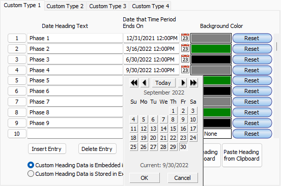
Easier entry of custom date headingsEntry of dates for custom headings has been made easier. Date icons to the right of the date field will bring up the date picker. After the first date is chosen, the date picker will automatically set the date for the next entry to make subsequent entries faster.
PROJECT AND PRIMAVERA XML INTERFACE IMPROVEDCleaner, updated interfaceCleaner, updated interface to Microsoft Project and Primavera XML includes improved communication of problems found during the import process.
See schedule changes in the color of your choiceWhen a schedule is changed via Project or Primavera refresh, updated symbols can be highlighted in any color.
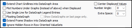
DATAGRAPH IMPROVEMENTSShow partial dataA new option makes it easier to use a filter to isolate certain types of data to a schedule subset. This is useful when using a filter to view just part of the schedule.
First, apply a filter, or hide the tasks that are not relevant. Then, right-click the DataGraph and choose DataGraph Properties:
INTERFACE IMPROVEMENTS
Bold current tabThe current toolbar tab is now bolded to make it easier to work with:
Move a toolbox rowEditing the toolbox has been made easier. In addition to being able to copy and paste toolbox rows, it’s now possible to move toolbox rows up and down within the toolbox. First, select an entire toolbox row. Then, right click and choose Move Selected Row.
Additional colors added to color paletteFor those who have a list of favorite colors, it’s possible to replace any of the colors in the color palette. At customer request, 5 new color slots have been made available to edit via Tools | Options | General | Customize Chart Colors. All colors except for white and black can be customized.
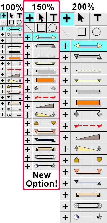
Toolbox size optionsThe Toolbox can now be displayed at, 100%, 150%, or 200%. Tools "Options "Edit or Right-click the Toolbox "Toolbox Properties
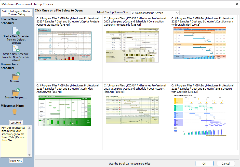
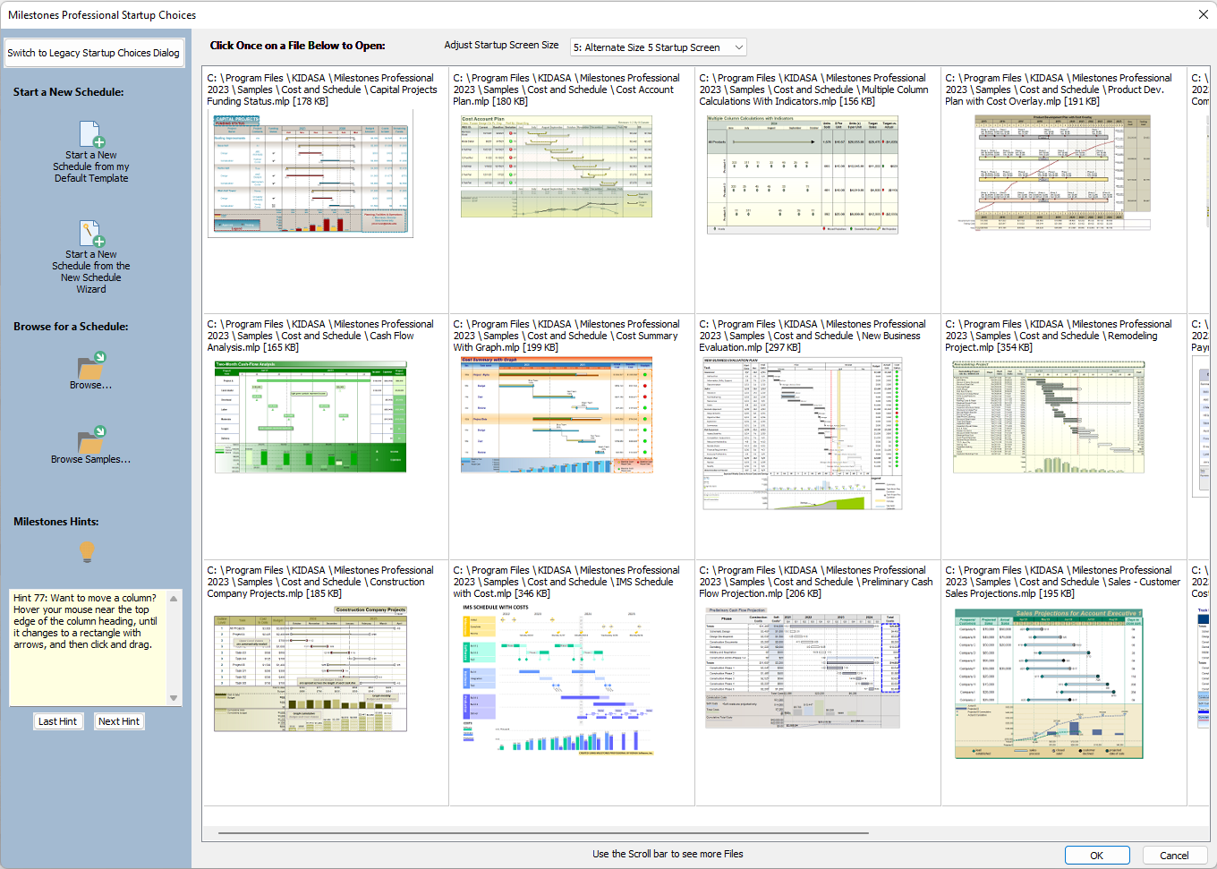
Startup enhancedThe startup screen now populates with sample schedules until your saved schedules dominate. The size of the startup screen can be adjusted at the top of the screen.
Smallest size, largest size:
|