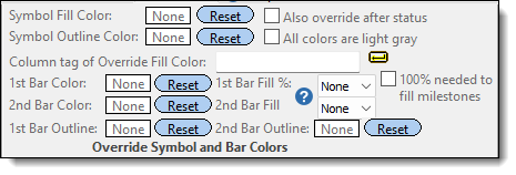
|

|
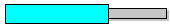
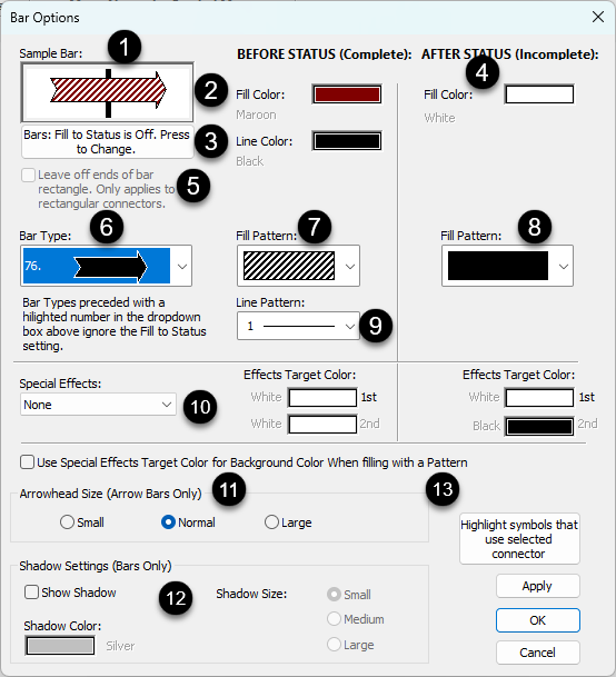
Sample bar
|
This illustrates the current bar properties and changes as changes are made on this panel.
|
 |
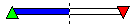
Before status fill color
|
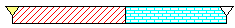
Each bar can have a before status fill color and an after status fill color. The before status color represents the completed portion while the after status color represents the future portion. |
 |
Before status line color |
|
 |
After Status color |
The default after status date fill color for a horizontal bar is white as shown (the vertical dotted line is the current date line and the default status date).
This color will appear after the status date if Bars: Fill to Status Date is checked. Both the before and after status colors can be changed. The before status color represents the completed portion while the after status color represents the future portion.
|
 |
Leave off ends of rectangular connector. |
Removes the vertical lines at the end of the horizontal rectangular bar: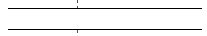 |
 |
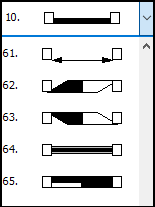
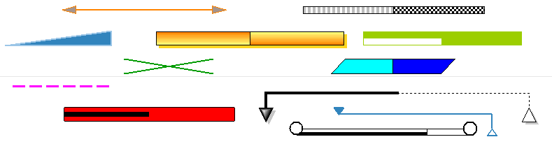
Bar type (shape)
|
Each bar in the toolbox and on the schedule can be changed to any one of 73 shapes.
|
 |
Fill pattern

|
57 available bar fill patterns include marbled color patterns.
Marbled bar fill patterns are full-colored bitmaps which will ignore any color fill settings. Use of these bar fill patterns increases the size of printer files and metafiles, especially on high-resolution printers. Thus, printing time may be increased.
|
 |
After status fill pattern
|
57 patterns available (see above)
|
 |
Line (outline) pattern and color  |
Choose from 29 line patterns.
|
 |
Special Effects 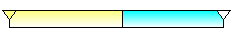
|
Special effects can be applied to both the before status and after status portion
Target color can be set for before and after status: 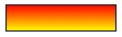
|
|
|
Outline pattern and color
|
|
 |
Arrow size for bars with arrows 
|
Some horizontal bars are lines with arrow endings. The size of these arrow endings can be customized.
Under Arrowhead Size, choose Small, Normal, or Large.
|
 |
Shadow size and color
|
-
Under Shadow Settings,  Show Shadow. Show Shadow.
-
Choose a Shadow Color from the list.
-
Choose a Shadow Size (Small, Medium, or Large).
|
 |
Highlight symbols that use selected connector
|
This is usually done to temporarily identify symbols which use the connector type.
|
| |
|
|
 (
(