|
A DataGraph converts ValueSet values to lineline, barbar or pointpoint graphs. Each schedule can have up to 3 separate DataGraphs and up to 9 separate ValueSets. Each DataGraph can display values from up to 8 ValueSets. See: Tutorial Lesson 11 - Introduction too ValueSets and DataGraphs and Tutorial Lesson 12 - More ValueSets and DataGraphs
Build a DataGraph
|
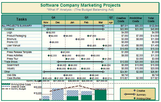
For example, a project's monthly budget numbers can be entered in a ValueSet and then displayed as line or bar graphs across the timeline

|
Follow these steps:
-
Create ValueSets. There are 5 types of ValueSets.
-
Add values to the ValueSets.
-
Create a DataGraph to display those values.
ValueSets are created and formatted under Tools | Graph Options | Set Up ValueSets. Five types:
-
Type 1: Enter values "globally" by time period. (Daily, Weekly, Monthly, Quarterly, Yearly)
-
Type 2: Enter values into task rows by time period.
-
Type 3: Allocate values from a column.
-
Type 4: Use values from symbols
-
Type 5: Total of other Valuesets
|
Create a ValueSet
|
Think about how the numbers to be graphed will be organized. Is there a single set of numbers which apply to the entire schedule (type 1), a set of numbers by time period for each task row (type 2), a single number for each task row (type 3), a number for each symbol (type 4), or will the ValueSet be a total of other ValueSets (type 5). Then:
Tools | Graph Options | Set Up ValueSets.
|
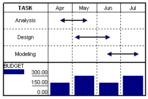
Type 1: Keyed-in global values
|
In this type of ValueSet, there is one set of values for the entire schedule. Values are entered by time period (daily, weekly, monthly, quarterly, or yearly).
In the example, one value is entered per month for the Budget ValueSet.
Values can be pasted from the clipboard.
See: Type 1 ValueSets
|
 |
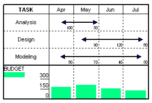
Type 2 ValueSets: Sum of values keyed into task rows
|
With a Type 2 ValueSet, values are entered by time period for each task.
In the example, Analysis has an April budget value and a May budget value; Design has May, June and July budget values; and Modeling has four monthly budget values.
Values can be pasted (for each task) from the clipboard.
Right-click a task and choose >Edit ValueSet to enter or paste in values for each task.
See: Type 2 ValueSets
|
 |
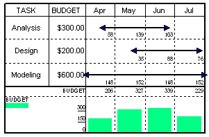
Type 3 ValueSets: Allocate column values across timeline
|
With a Type 3 ValueSet, values are entered in a column. The values entered are then spread across each task's time span
In the Analysis task in the example, the $300 is distributed evenly across the task bar that covers April, May, and June. The amount for each month is based upon the total number of days in that month that the task bar covers. (Notice that the value for May is larger since it is a full month.)
The distributed values for all tasks are totaled for each month, displayed above the graph, and graphed in the DataGraph area.
See Type 3 ValueSets
|
 |
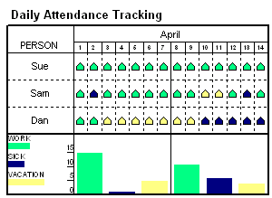
Type 4 ValueSets: Use values from symbols
|
Type 4 ValueSets use values that are entered for each symbol. This type of ValueSet gives a great deal of flexibility and has many possible applications, include "What-if" analysis.
The employee attendance example has three Type 4 ValueSets. The example shows the daily attendance for three employees (Sue, Sam and Dan). The green symbols have a value of 1 entered for the "Work" ValueSet. The blue symbols have a value of 1 entered for the "Sick" ValueSet, and the yellow symbols have a value of 1 entered for the "Vacation" ValueSet. This schedule has ValueSet alignment.
See Type 4 ValueSets
|
 |
Type 5 ValueSets: Total of other ValueSets
|
Type 5 ValueSets offer an easy way to display a total of other ValueSets. In the example, Item 1 and Item 2 ValueSets are summed for the Total ValueSet. Here are some characteristics of Type 5 ValueSets:
See Type 5 ValueSets
|

|
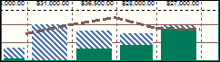
 Values can be displayed as line, bar or point graphs. Point ValueSets can be paired to create high-low connections. Also, bar graphs can be stacked. Use a ValueSet SmartColumn to display selected ValueSet values and/or indicators. Values can be displayed as line, bar or point graphs. Point ValueSets can be paired to create high-low connections. Also, bar graphs can be stacked. Use a ValueSet SmartColumn to display selected ValueSet values and/or indicators.
Add ValueSets to a DataGraph
-
Choose Tools | Graph Options | Setup DataGraphs.
-
Click the tab for one of the 3 DataGraphs.
-
Click the Assign ValueSets to this DataGraph button.
-
 one or more ValueSets to add to the DataGraph. one or more ValueSets to add to the DataGraph.
-
Choose from other DataGraph formatting options.
-
Choose OK.
|
 |
DataGraph Display Format
| While many properties are set in the individual ValueSets, some properties are set for each of the 3 DataGraphs |
-
Choose Tools | Graph Options | Setup DataGraphs.
-
Click the tab for one of the 3 DataGraphs.
-
Show this Graph and set a Graph Height. A height of 1.3 is a good starter.
-
See the image to the right for the available Data Display Formats.
-
Plot ValueSets and Y-Axis in Schedule Area to overlay the graph on the schedule. (See example) Optionally, Show Y-Axis on left.
-
For Y-Axis, leave all 3 values as zero for automatic calculation. Otherwise, put in values for High, Low and Increment.
-
Include Horizontal Gridlines to show gridlines in the DataGraph.
-
Extend chart gridlines into DataGraph area. This extends the vertical gridlines which are set for the schedule into the DataGraph area.
-
Plot Numbers under graphs to show listed numbers under the graph instead of on top (default.)
-
Use Single Line for DataGraph Legend Entries for a more compact legend.
-
Floating DataGraph for a DataGraph which can be moved (vertically).
-
Extend Frame Shadow into DataGraph area to add the schedule's shadow to the DataGraph.
-
Ignore Hidden Rows in Row Oriented ValueSets to show only values for tasks which are not hidden.
|
Data Display Formats:
Bars: 
Wide Bars: 
Line: 
Point: 
Stacked Bars: 
Overlay the graph on the schedule:

Show Gridlines and Overlay DataGraphs:
Single Line for DataGraph Legend Entries
Not checked Checked
 
|
|
Overlay ValueSets from DataGraph 2 and/or 3 on top of DataGraph 1 ValueSets
It's possible to combine two DataGraphs. One of the DataGraphs must be DataGraph1. The second DataGraph can be DataGraph 2 or 3.
-
Choose Tools | Graph Options | Setup DataGraph.
-
Click the tab for DataGraph 2 (or 3).
-
Assign ValueSets to this DataGraph.
-
For Data Display Format, choose  Lines. Lines.
-
Click the tab for DataGraph 1.
-
Click the Assign ValueSets to this DataGraph button.
-
Overlay ValueSets from DataGraph 2 (or 3) to display one graph's valuesets on top of DataGraph 1.
-
Press OK.
|
|
DataGraphs Placement
|
The DataGraphs can be undocked or floated from the bottom of the schedule. The floating DataGraph can be moved under, on, or above the schedule. Note that the DataGraph can cover task rows.
The DataGraphs can also be displayed on the last page, only.
Float the DataGraphs:
-
Choose Tools | Graph Options | Setup DataGraph.
-
Floating DataGraph. (This option is found at the bottom of the dialog box).
Display the DataGraphs on the last page, only:
-
Choose Tools | Graph Options | Setup DataGraph.
-
Floating DataGraph.
-
Show DataGraphs on last page Only.
Move or re-size floating DataGraphs:
Floating DataGraphs cannot be moved to the left or right, but they can be moved up and down. The width is fixed, but the height can be adjusted.
- Click
 (the toolbox Arrow tool.) (the toolbox Arrow tool.)
- To move the DataGraph, hover the cursor over the DataGraph frame. The cursor changes to a four-arrows cursor. Click and drag to move the DataGraph.
- To re-size the DataGraph, hover the cursor over a corner of the DataGraph frame or at the midpoint along the top or bottom of an edge. Click and drag to re-size the DataGraph.
Overlay ValueSets from a single DataGraph
- Right click the DataGraph and choose Properties.
- Plot ValueSets and Y-Axis in Schedule Area...
Overlay ValueSets from multiple DataGraphs:
- Right click a DataGraph and choose Properties.
- Click the tab for DataGraph1.
- Overlay ValueSets from DataGraph2 to overlay the ValueSets from that graph.
- Overlay ValueSets from DataGraph3 to overlay the ValueSets from that graph.
Hide the y-axis for a DataGraph which is no longer needed:
If a schedule displays the y-axis but no values are displayed, it's possible the schedule was originally set up with a DataGraph but now does not include one. Hide the y-axis:
- On the Tools tab, choose Graph Options | Setup DataGraphs.
 Show This Graph for whichever Datagraph has this option checked: Plot ValueSets and Y-Axis in Schedule Area... Show This Graph for whichever Datagraph has this option checked: Plot ValueSets and Y-Axis in Schedule Area...
|
Set up a "hi-low" graph:
-
Set up 2 ValueSets, one for the High values and one for the Low values. For this example, they will be called High and Low.
-
In the Graphic Properties for the High ValueSet, make a selection for Symbol for Point Graphs. Also, set the line color and pattern.
-
In the Graphic Properties for the High ValueSet, make selections for Line Style and Line/Bar Color.
-
In the Graphic Properties for the High ValueSet, set the High/Low Graph Connection to Low (the other ValueSet) so that the High and Low ValueSets will be connected.
-
In the Graphic Properties for the Low ValueSet, make a selection for Symbol for Point Graphs.
-
Add both ValueSets to a DataGraph.
-
Set the Data Display Format to Points.
|